FIX IT. BUILD IT.
BRAND RE-DESIGN FOR WELSH PROPERTY DEVELOPMENT & MAINTENANCE SPECIALIST.
SCOPE: LOGO & BRAND IDENTITY RE-DESIGN
SECTOR: CONSTRUCTION
‘Fix it. Build it.’ is a well established Welsh property development and maintenance company, specialising in extensions, renovations and all aspects of building work. Our client Dave came to us wanting a refresh to his existing brand identity, with the requirements of updating his logo, typefaces and imagery to create a modern and clean look for his business.
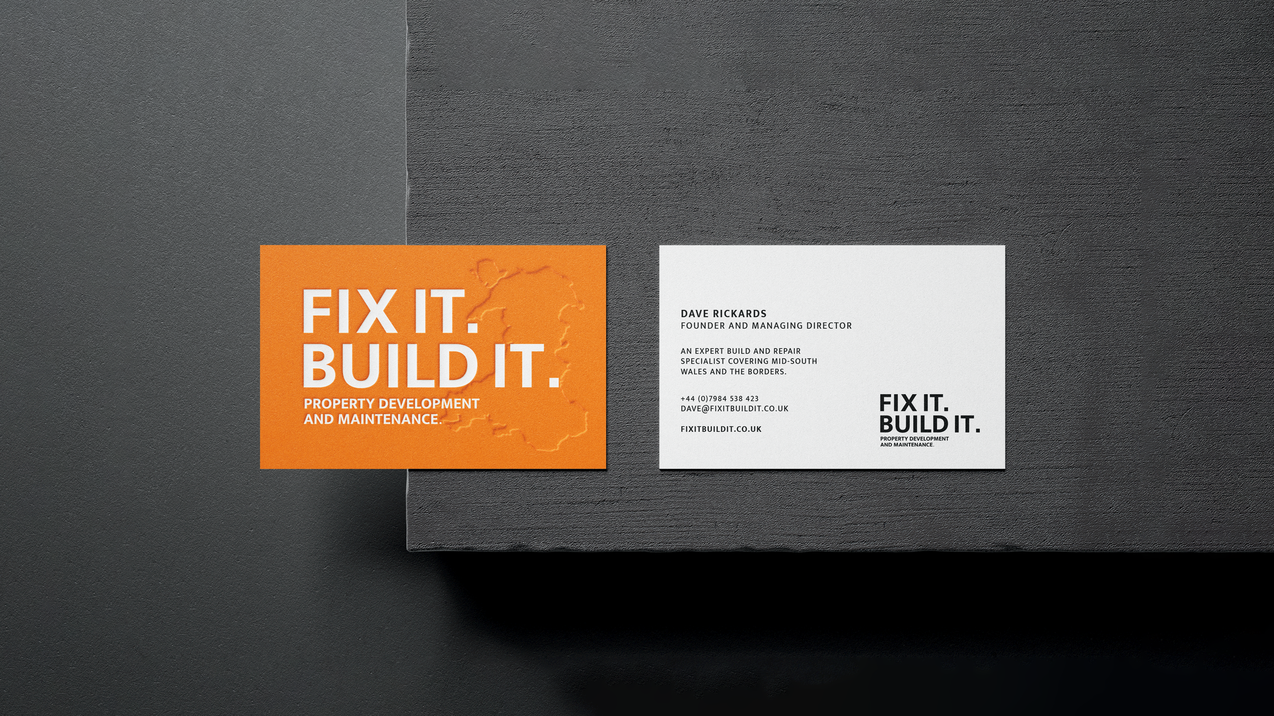
As part of the new brand, Dave wanted to respect the original logo and colour scheme and incorporate this into the new design styling. For example, the original orange squares from the previous logo were shrunk down to form the full stops within the new one. To further simplify the logo, one solid colour would be used. The typeface used to create the logo (Mukta Mahee Bold) was specifically chosen for its strong, sharp and precise characteristics which matched the company’s sector well.
Various marketing collateral and visual mock-ups were presented to the client for consideration, alongside suggestions for website and social media updates, which we are aiming to begin updating in the coming months for Dave.
“My logo and brand really needed a new look and I think it’s been brought right up to date now, I think it looks great! It has kept the feel of the old brand but modernised it, looks very professional and is easily recognisable - it’s everything I hoped for!”
— Dave Rickards | Managing Director at Fix It Build it